The Psychology of Color in Health-Focused Interior Design

Photo sourced from: Will Gamble Architects
Color is one of the most powerful tools in interior design, yet it often operates quietly, shaping how we feel long before we consciously register it.
In health-centered interiors, color is not chosen for trend or novelty. It is selected for its psychological impact, its relationship to light and material, and its ability to support how a space is meant to be experienced. When used thoughtfully, color can calm the nervous system, improve focus, and contribute to a sense of balance throughout the home.
Understanding the psychology of color allows homeowners to make more informed, lasting design decisions—ones that support well-being rather than overwhelm it.
How Color Affects the Mind and Body
Color perception is both emotional and physiological. Different hues influence mood, energy levels, and even heart rate. In interior design, these effects are amplified by scale, lighting, texture, and context.
Health-focused interior design considers:
How color interacts with natural and artificial light
The emotional tone a space should support
The relationship between adjacent rooms
Long-term livability rather than short-term impact
Rather than dramatic contrasts, health-focused homes often rely on nuanced palettes that feel stable and restorative over time.
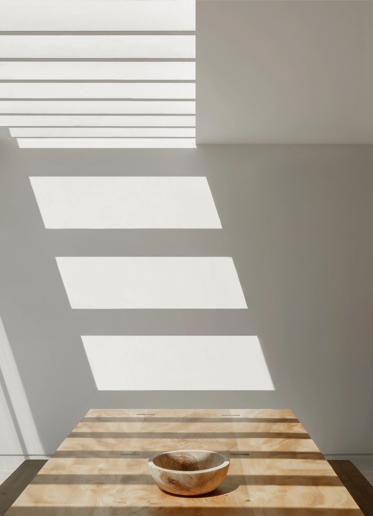
Photo sourced from: Will Gamble Architects
Neutrals as a Foundation for Calm
Neutral tones are often misunderstood as safe or uninspired. In reality, they form the backbone of many health-oriented interiors.
Warm whites, soft greens, and muted beiges provide visual rest and allow the mind to settle. These colors reflect light gently and adapt well throughout the day, creating spaces that feel consistent rather than stimulating.
In luxury interiors, neutrals are rarely flat. Depth is achieved through:
Subtle undertones
Layered textures
Natural materials such as wood, stone, and plaster
This approach creates a sense of quiet cohesion across the home.
Earth Tones and the Sense of Grounding
Earth-inspired colors, such as clay, sand, soft terracotta, and warm browns, are closely tied to feelings of stability and comfort.
These hues connect interiors to the natural world and are especially effective in spaces designed for rest or reflection, such as bedrooms, libraries, and sitting rooms. Used thoughtfully, earth tones create warmth without heaviness and familiarity without repetition.
They pair particularly well with natural materials, reinforcing a sense of groundedness that supports emotional ease.
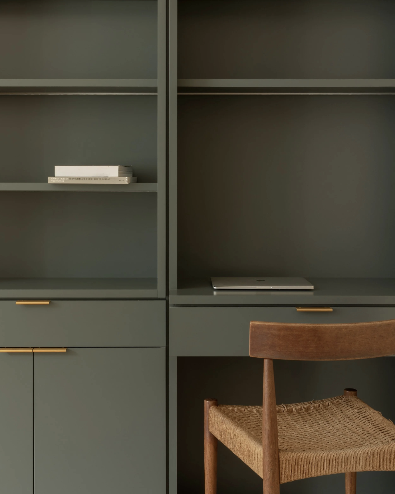
Photo sourced from: Will Gamble Architects
Blues and Greens for Restoration
Blues and greens are often associated with calm, but their effects vary significantly depending on tone and saturation. These should be chosen very carefully.
Soft greens tend to evoke a sense of balance and renewal, making them well-suited for living spaces, bedrooms, and areas.
Muted blues can encourage relaxation and focus.
In health-centered interior design, the goal is to support restoration, not stimulation.
Warm Accents and Emotional Comfort
Warm colors, such as soft blush, muted ochre, or gentle amber, can introduce emotional warmth when used sparingly.
Rather than dominating a space, these tones are often incorporated through textiles or art. When balanced with neutral foundations, they add dimension and comfort without creating visual noise.
This restrained use allows warmth to be felt rather than announced.
Color, Light, and Orientation
The psychological effect of color cannot be separated from light.
A shade that feels soothing in a north-facing room may feel flat in a sun-filled space. Health-focused color selection accounts for:
Directional light
Seasonal changes
Time of day the space is most used
This consideration ensures that color consistently supports the intended experience, rather than shifting unpredictably.
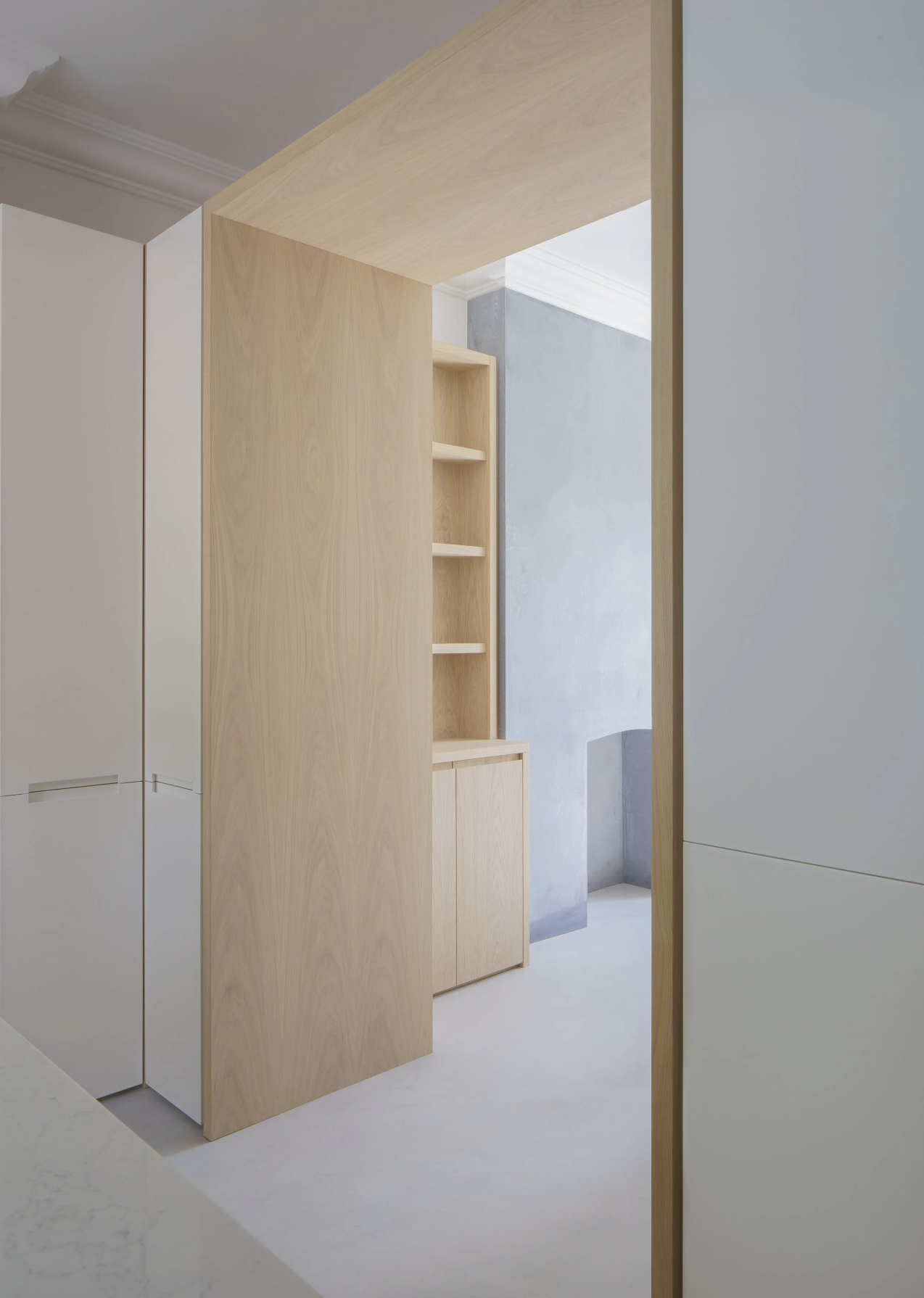
Photo sourced from: Will Gamble Architects
Creating Flow Through Color
Health-focused interiors benefit from continuity.
Rather than sharply contrasting rooms, color palettes often evolve gradually throughout the home. This visual flow supports ease of movement and reduces subconscious tension.
Related tones, repeated materials, and subtle variation allow each space to feel distinct while remaining connected—an approach particularly suited to larger homes.
Color as a Long-Term Decision
Unlike furnishings or accessories, color choices tend to remain in place for many years. In health-centered interior design, longevity matters.
Choosing colors based on how they support daily life, rather than seasonal trends, leads to homes that feel relevant, calm, and supportive over time.
The most successful palettes are those that fade into the background of life, quietly enhancing it rather than competing for attention.
A Thoughtful Approach to Health Through Color
Color is not decorative in health-centered interiors. Color is foundational.
When selected with care, it supports comfort and emotional balance, shaping how a home feels long after the design is complete.
At StudioVera Design, we guide clients through the color selection process, ensuring each space supports both well-being and enduring beauty.
Inquire today to begin your health-centered design journey.